
Curing chaos
in healthcare
reimbursement.
WELLRIMTHS
Boldly disrupting a broken system with brand strategy that exposes the fraud, waste and abuse in healthcare billing.

BACKGROUND
How can WellRithms
move from standard
to stand apart?
Medical overbilling costs self-funded employers, unions, and administrators billions of dollars every year — it hurts everyone. WellRithms helps payors eliminate those losses by reviewing medical bills, repricing them based on the true market value for services, and guaranteeing the savings. Using a proprietary AI solution, backed by real physicians, WellRithms stands apart from other bill review companies by fully shielding payors from financial and legal liability. However, their brand did nothing to communicate this powerful difference, leaving them in indistinguishable in the market.
Fort West was tasked with developing a bold brand that cuts through the clutter, clarifies their offering, and demonstrates the incredible value WellRithms brings to payers and patients alike.
Services
+ Brand Strategy
+ Brand Design
+ Brand Activation
BRAND STRATEGY
Disrupting an
industry starts with
mutual understanding.
We spoke with key stakeholders, current clients, and industry consultants to better understand the industry landscape and WellRithm’s unique right to win. With that understanding, we led the executive team through a comprehensive workshop that exposed opportunities and co-created an ownable position that turned a complicated value proposition into a powerful nemonic that is simple and easy to understand.


STRATEGIC TARGET
The
Truth Seeker.
The strategic target is a representation of the brand’s ideal customer. We explore their related interests and adjacent cultures to inform our messaging, design, activations, and other tactical decisions.
We defined WellRithms’ strategic target as The Truth Seeker. The Truth Seeker chooses clarity over complacency. Innately curious, their tenacious spirit and unwavering grit help them thrive in complex situations where others may feel pressure to conform.
Core Values Org. Benefit
+ Knowledge ⟶ + Clarity
+ Courage ⟶ + Confidence
+ Contribution ⟶ + Opportunity
+ Innovation ⟶ + Partnership

BRAND CHARACTER
Introducing the
Principled Pioneer.
The brand strategy is brought to life through the development of a brand character. When used properly, a brand character creates differentiation and consistency in marketing communication. We utilize archetypes to help personify the brand’s offering and promise — unique to Fort West, we then identify and combine two sub-archetypes to create an ownable character that sets the brand apart, and becomes the driving force for all expression. WellRithms is a combination of the “Advocate” and the “Engineer.”


BRAND DESIGN
Stand for
something, or
fall for anything.
Under the guidance of our new brand character, we created a completely new ethos for the brand. Our design theme embraces the pursuit of justice — reflecting steady progress and an enduring vision for a better future that never loses sight of the people we’re doing it for.
We have a message to share. Bold. Truthful. Expressive. We’re calling for a better tomorrow. We use strongly worded type. Condensed, ALL CAPS letterforms speak with energy. Our imagery connects with the people of whom it’s all about — in an honest unfiltered editorial look.


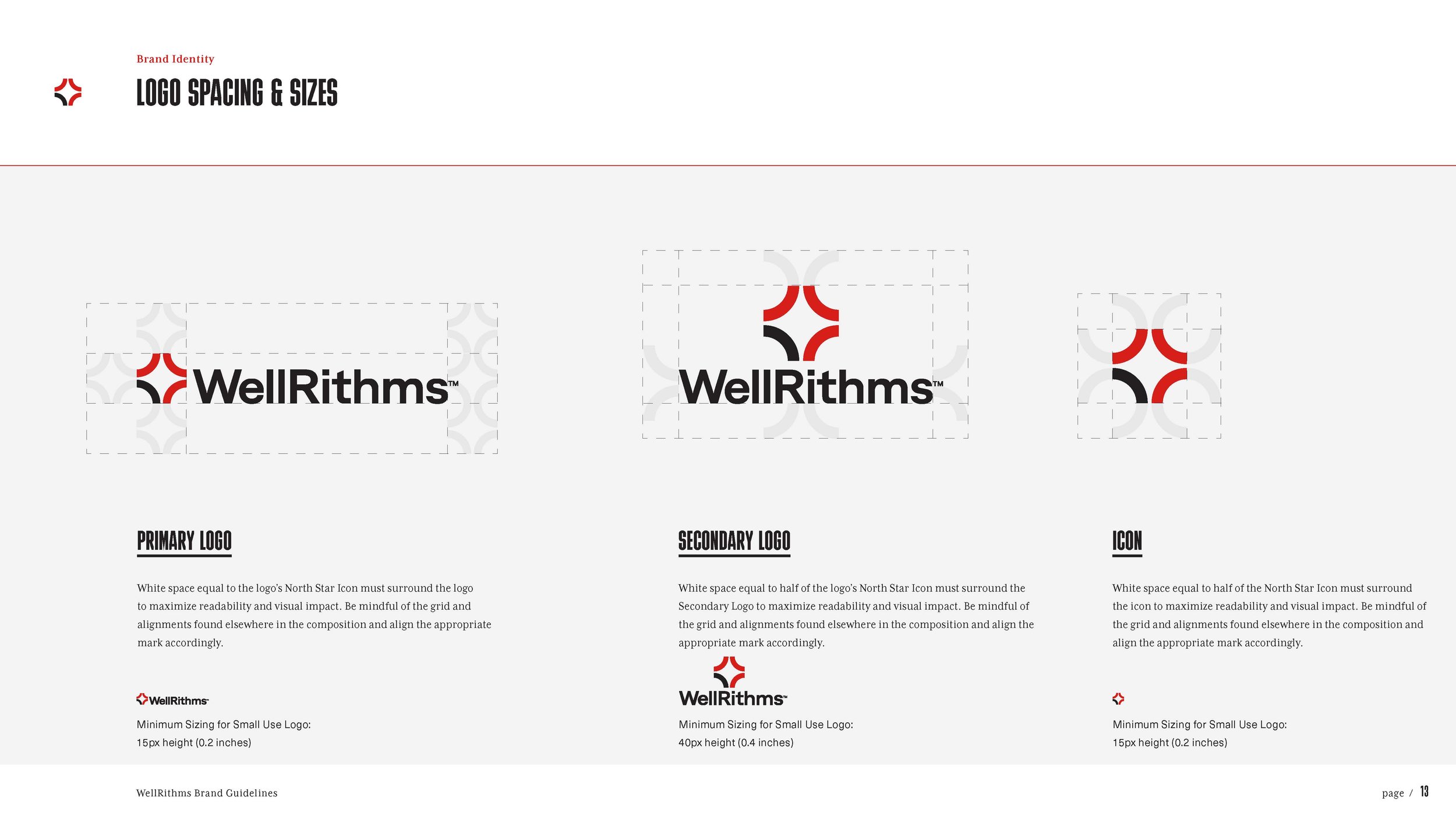
VISUAL IDENITY
A new guiding
light for WellRithms.
Our new mark, named “The North Star”, symbolizes the tension between innovation and a broken system. A broken black and red circle emphasizes data, showing the contrast between actual costs and excess billing. It’s distinct, and pushes against the norm. However, despite the tension, the logo carries a sense of hope, optimism, and a call to action for positive change and transformation.
ORIGINAL LOGO


LOGO EVOLUTION


MESSAGING SYSTEMS
Bringing truth and
transformation to
chaos and complexity.
As an extension of our brand character, The Principled Pioneer, we developed four distinct but complementary messaging angles that give purpose, personality, meaning, and structure to WellRithms’ communication. Our goal is to help our audience better understand the status quo, and empower them to join WellRithms in the fight to change it. These guidelines provide direction and useful boundaries that create consistency and equity in WellRithms’ most important messages.


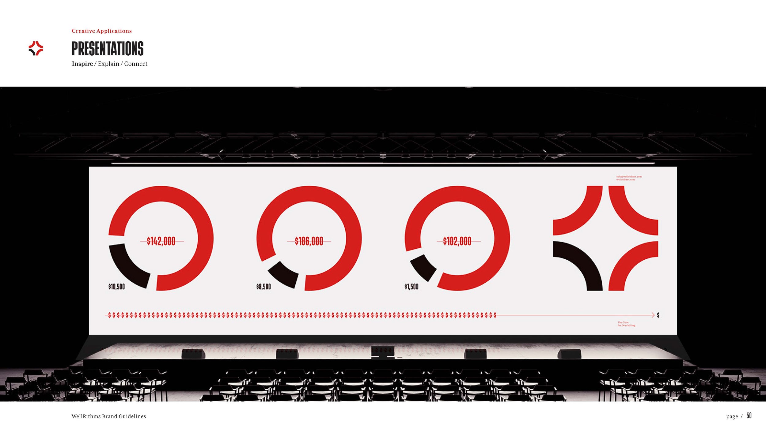
BRAND ACTIVATION
Bringing WellRithms’
North Star to life.
Complexity is the enemy. Drawing from our earliest insights, everything we created for the brand had to feel true to their founding beliefs and consistent with our design principles. Simple. Bold. Direct. All communication assets followed our defined messaging hierarchy, designed to inspire, explain, or connect.


OUTCOMES OVER OUTPUT
“Our rebrand has helped us find our voice. We now have a common language that all agree on, and when we each want to go our own direction, we’re able to come back in a unified way and really be WellRithms, inside and out. ”
Anna Quorum, Co-Founder & Chief Operating Officer